
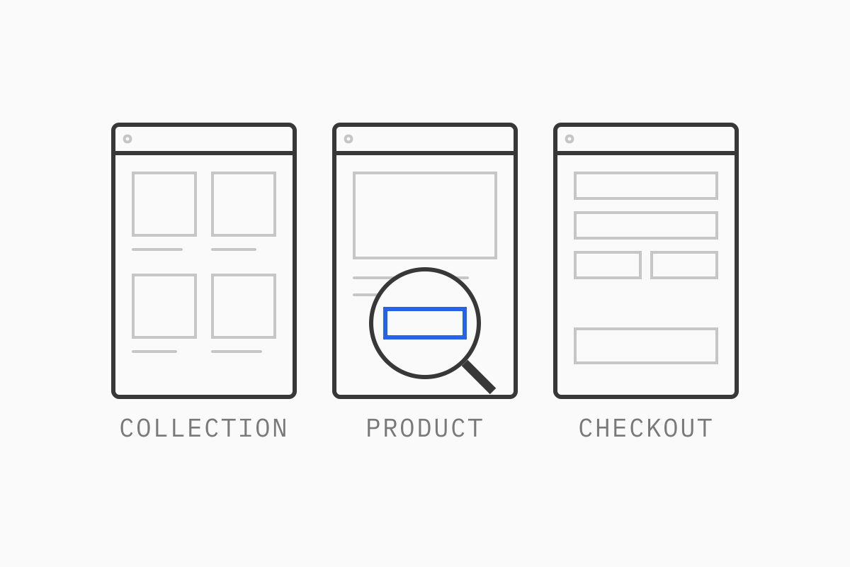
We check that your analytics can be trusted, find the steps where people drop out, review speed and every key page type, and end with a prioritized list of fixes and tests that we then work through with you. If an audit ends with a slide of “best practices” and no order of work, it isn’t finished.
This guide walks through what we look at when we audit a DTC store, step by step. We audit Shopify and Shopify Plus stores, Contentful sites, headless storefronts and custom platforms; where a check is Shopify-specific, we say so.
01What we deliver
Every audit ends with five deliverables:
A baseline: conversion rate, average order value and revenue per visitor, by device and traffic source, from data you can trust.
What could be improved: specific issues on specific pages, each with the evidence behind it, and the two or three funnel steps where you lose the most revenue.
KPIs to measure progress against.
A task list with effort estimates, so the work can be prioritized.
An action plan grouped by team: UX, design, development, data and tracking, content, and marketing (including email and paid media).
A UX audit and a CRO audit overlap heavily. The UX side asks whether the store is easy to use. The CRO side asks which of those problems cost money, and how much. We run them together, because a usability issue on a page with 2% of traffic is a different priority from the same issue on your best-selling product page.
02We start with the data
The first step is making the data reliable, because every later decision depends on it. We set the baseline before we look at any page.
03Analytics and tracking: getting data we can act on
This is what the data check covers:
Purchase events match orders. Compare orders in Shopify with purchases in GA4 or your analytics tool for the same period. A large gap usually means missing events after a theme change, or a checkout migration that broke tracking.
The funnel events exist and fire once. View item, add to cart, begin checkout, add shipping, add payment, purchase. Missing or doubled events make funnel reports useless.
Pixels installed twice. The same pixel added through an app and again through Shopify’s Customer Events or the tag manager counts every purchase twice in your ad platforms.
Events lost in the checkout upgrade. Shopify began switching off the old “additional scripts” box on the thank you and order status pages for Plus stores in August 2025 and finished with automatic upgrades from January 2026; every other store followed on August 26, 2026. If tracking in that box wasn’t rebuilt as a custom pixel before the upgrade, purchase events have been missing since.
Checked at the source. We trigger each event ourselves in the browser and inspect what the data layer and each pixel send, rather than trusting the GA4 report.
Consent impact. Shopify’s own documentation notes that when visitors decline non-essential cookies, you can see lower session counts and changes to metrics built on them, including conversion rate. If you trade in the UK or Europe with an opt-in banner, your reported conversion rate is calculated on a partial set of sessions. That’s fine, as long as everyone reading the dashboard knows it.
Tool disagreement. Shopify Analytics and GA4 count sessions differently, so they will never match exactly. We pick one source of truth per metric and write down why.
Clean data. Bot and internal traffic filtered out, and test orders excluded, so they don’t inflate sessions or orders.
If tracking is badly broken, fixing it becomes the first recommendation, and the rest of the audit leans more on qualitative evidence until the data recovers.
04Funnel analysis: where buyers drop
With data we trust, we map the funnel. Shopify’s conversion rate breakdown report shows four steps: sessions, sessions with an add to cart, sessions that reached checkout, and sessions that completed checkout. We then segment it:
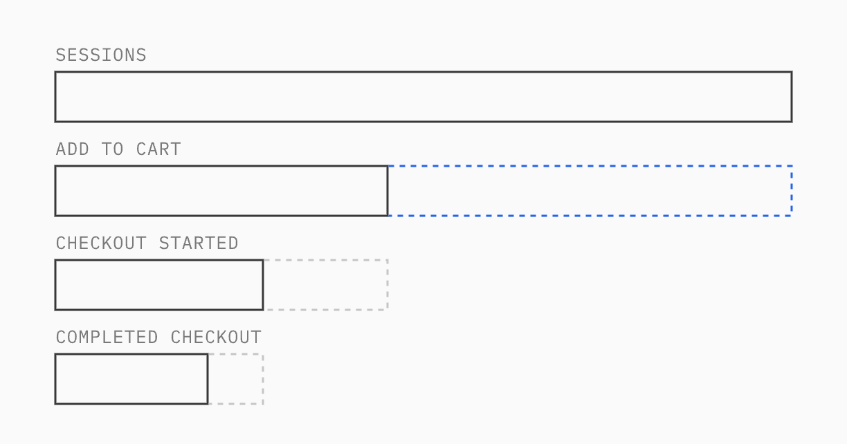
By device. Mobile usually carries most of the traffic and a lower conversion rate. The question is whether the gap is normal for your category or a sign that something on mobile is broken.
By traffic source. Paid social, paid search, email and organic visitors arrive with different intent. A low add-to-cart rate from paid social can be a targeting problem.
By landing page. Shopify’s sessions by landing page report shows where visits start. Many stores design for the homepage while most paid traffic lands on product or collection pages. For organic traffic, our guide to the eCommerce SEO audit covers how those pages get found.
New vs returning. Returning customers hide problems that first-time visitors hit.
The goal is a short list of steps where the drop is larger than it should be, with a rough revenue figure attached to each. We read average order value and revenue per visitor alongside conversion rate, because a change that lifts conversion by discounting harder can still lose money.
05Speed and Core Web Vitals as conversion problems
A slow page loses buyers before they even see the product. We review Core Web Vitals field data for your key templates: Largest Contentful Paint (good is 2.5 seconds or less), Interaction to Next Paint (200 milliseconds or less) and Cumulative Layout Shift (0.1 or less), measured at the 75th percentile and split by mobile and desktop. Shopify now includes web performance reports in its analytics for these same metrics.
We look past the score to the cause: oversized hero images, app scripts loading on every page, a variant picker that blocks the main thread, a sticky banner that pushes content down. Our eCommerce site speed guide covers how to measure this properly.
06Page-by-page UX review
This is the largest part of the audit. We review each template on a real phone and on desktop, as a first-time visitor, with your funnel data open beside it.
Homepage and landing pages
Is the offer clear in the first screen on mobile: what you sell, who it’s for and why to buy here?
Does each paid landing page match the ad that sent the visitor, in product, offer and wording?
Is there one obvious next step, or several competing calls to action?
Navigation and search
Can a new visitor find your main categories in one tap?
Do menu labels use your customers’ words or internal product names?
What does search return for common misspellings, synonyms and product attributes? Shopify’s reports for searches with no results and searches with no clicks are a quick way to find gaps. Our guide to AI for eCommerce covers where semantic search helps.
Collection pages
Filters that match how people shop the category (size, material, color, price).
Sort order that puts sellable, in-stock products first.
Product cards with enough information to choose: price, key variant, swatch, stock signal.
When we customized the Shopify Plus theme for a fine jewelry brand, restructuring navigation around four core categories and adding filters for style, stone, material, color, price, size and length was a central part of the work.
Product pages
In our audits, product pages are usually where we find the most to fix. We check:
Content. Does the page answer the questions customers ask support? Materials, sizing, fit, care, compatibility.
Images. Enough angles, scale and in-use shots, fast to load, usable on a small screen.
Variants. Clear selection, unavailable options handled well, the price and image updating with the choice.
Trust. Reviews placed near the decision, payment options, guarantees that are specific rather than generic badges.
Delivery and returns. Cost and timing visible before the cart. At the time of writing, Baymard Institute’s checkout research lists extra costs (shipping, taxes, fees) as the top reason shoppers abandon a checkout, cited by 40% of those who left for reasons other than just browsing.
For the same brand, the theme work also included detailed product pages and a gift-with-purchase feature its team configures in the theme editor.
Cart
Totals and delivery thresholds stated plainly.
Upsells that are relevant and don’t push the checkout button below the fold on mobile.
Express payment options visible where your customers expect them.
Cart and checkout recovery emails set up, well timed and showing the cart contents. They’re often one of the quickest wins in an audit.
Checkout
At the time of writing, Baymard Institute puts the average documented cart abandonment rate at around 70%, across 50 studies. Not all of that is recoverable: many people use the cart to save items or compare prices. The fixable part sits in the checkout itself.
On Shopify, what you can change depends on your plan. All plans can apply branding (logo, colors, fonts) in the checkout editor and add eligible apps to the thank you and order status pages. Shopify Plus stores can add checkout UI extensions to the information, shipping and payment steps and use the Checkout Branding API. Shopify Functions handle logic such as discounts, hiding or reordering payment and delivery options, and validation. Shopify Scripts, which Plus stores used for custom discount, shipping and payment logic, stopped running on June 30, 2026, so we check that any custom logic was rebuilt with Functions or an app and still applies the right prices.
Within those limits we review field count, account requirements, address lookup, delivery option clarity, payment methods by market, and error messages. Baymard’s 2024 benchmark found the average checkout has 11.3 form fields, against the eight they consider enough. If you run discount codes, we also check that current offers are shown on the site, so shoppers don’t leave checkout to search for a code.
Account and post-purchase
Order tracking that’s easy to find without logging in.
Returns and exchanges that customers can start themselves.
Post-purchase emails and flows that set expectations and bring people back. This is where on-site UX meets your email platform (Klaviyo, for example), and gaps between the two are common.
07Design, mobile and accessibility
Inconsistent design costs trust in small ways: three button styles, two type scales, landing pages built in a page builder that look nothing like the theme. We look for:
Consistent components across templates, especially calls to action.
Tap targets, font sizes and spacing that work one-handed.
Content that appears on desktop but is hidden or truncated on mobile.
Pages built in app-based page builders that are slow or hard to maintain.
Accessibility checks overlap heavily with UX, and they matter commercially: the European Accessibility Act has applied to most online stores selling to EU consumers since June 2025, and accessibility lawsuits are common in the US. We check:
Color contrast on text, buttons and prices.
Visible focus states and full keyboard use, including menus, filters and the cart drawer.
Labels on every form field, and error messages that say what to fix.
Alt text on product and content images.
Design is part of the fix. We work with your designers or your design agency and build their designs. When there’s no designer on the project, we write the brief with your team and handle the design ourselves.
08Qualitative research: why people drop
Analytics tells you where. These sources tell you why:
Session recordings and heatmaps on the steps with the largest drops, using Microsoft Clarity or Hotjar. We watch for rage clicks, repeated variant changes and scrolling past the add-to-cart button.
On-site surveys at exit or after purchase, with one open question. If you already use an email platform such as Klaviyo, its sign-up forms can often collect short survey answers and save them to customer profiles.
User tests with five or so people who match your customers, given a real task.
Support logs and reviews. The same question asked 30 times a month is a content gap on the product page.
09Turning findings into a prioritized list
An audit can easily produce 80 observations. The useful part is the order. We score each one on three things:
Impact: how much revenue passes through that step, and how big the problem looks.
Confidence: how strong the evidence is. A broken add-to-cart on Safari is certain; a hunch about button color is not.
Effort: developer, design and content time to change it.
Then we sort findings into three groups:
Fix directly. Bugs, broken tracking, missing delivery information, slow scripts. Testing these wastes time, because the outcome is obvious.
A/B test. Changes where the outcome is uncertain and you have enough traffic to learn: a new product page layout, a different cart upsell, a changed offer. Our guide to A/B testing on Shopify covers sample sizes and when a test is worth running.
Watch or drop. Low-impact or low-confidence items. Writing them down stops the same idea coming back every quarter.
The result is the task list and action plan described above, with an effort estimate for each item and every item assigned to a team.
10Read benchmark conversion rates carefully
The first question we’re asked is usually “what conversion rate should we have?” Published averages are a weak guide. They mix categories, price points, traffic sources and countries, and they’re affected by consent banners and how each tool counts a session. A store selling $400 jewelry and one selling $25 snacks shouldn’t compare themselves.
Your own trend is a better benchmark: conversion by device and source, month over month, with the tracking fixed. If you want an external reference, compare only against stores with a similar price point and traffic mix, and treat the number as a question rather than a target.
11eCommerce UX audit checklist
A short version to scan:
Shopify orders and analytics purchases match within a known margin
Funnel events fire once each, from view item to purchase
Each pixel installed once, with events checked in the browser
Thank you page tracking rebuilt as custom pixels for the checkout upgrade
Bot traffic, internal traffic and test orders excluded from reports
Average order value and revenue per visitor baselined alongside conversion rate
Consent impact on data understood and documented
Funnel split by device, source, landing page and new vs returning
Core Web Vitals pass at the 75th percentile on key templates
Offer clear in the first screen on mobile; landing pages match their ads
Main categories reachable in one tap; search handles synonyms and typos
Collection filters match how customers shop
Product pages answer sizing, materials, delivery and returns
Variant selection clear; out-of-stock options handled
Delivery cost and timing visible before checkout
Checkout fields, account requirement and payment methods reviewed
Custom discount and shipping logic rebuilt after Shopify Scripts ended
Cart and checkout recovery emails reviewed
Post-purchase tracking, returns and emails reviewed
Design components consistent across templates and on mobile
Contrast, focus states, form labels and alt text checked
Recordings, surveys and support logs reviewed for the biggest drops
Findings scored and split into fix, test and drop
12Getting an audit
Our audits combine an analytics review, a performance review and a UX review of your store, and end with the five deliverables above, from the baseline to an action plan for each team. We take a technical approach to CRO: we check the tracking and the code behind each problem as well as the design. Our developers have 15 years in eCommerce and have launched more than 25 Shopify stores, so each recommendation comes with a realistic view of what it takes to build. You can see the related work on our Growth services and Shopify development pages.
If you want a clear view of where your store is losing buyers, request an audit.
13FAQ
What is a CRO audit?
A CRO audit reviews an online store’s analytics, funnel, speed and page-level UX to find where visitors drop out and why. It should end with a prioritized list of fixes and tests, not a general set of best practices.
What’s the difference between an eCommerce UX audit and a CRO audit?
A UX audit asks whether the store is easy to use. A CRO audit adds data: which problems affect the most revenue and in what order to fix them. In practice the two work best together.
How do you do CRO on Shopify?
Start by checking your tracking, then use Shopify’s conversion and landing page reports to find weak funnel steps. Fix clear bugs directly, A/B test uncertain changes, and remember that checkout customization on the information, shipping and payment steps needs Shopify Plus.
What tools do you need for a CRO audit?
Your analytics (GA4 or similar), Shopify’s own reports, Google Search Console, a session recording tool such as Microsoft Clarity or Hotjar, and PageSpeed Insights for Core Web Vitals. Most are free; the work is in reading them together.